
Best Practices for Android App UI Development in Java
- shubhangisingh453
- Mar 21, 2023
- 7 min read

Optimizing user experience is a crucial aspect of Android app development. It involves creating an intuitive and user-friendly interface that engages and retains users. To achieve this goal, developers need to adhere to certain best practices that ensure the smooth functioning and visual appeal of the app.
One of the key factors in optimizing user experience is ensuring that the app's UI design is responsive and scalable. This means that the app should be able to adapt to different screen sizes and resolutions. Developers can achieve this by designing layouts that are based on relative measurements rather than absolute values. This ensures that the app looks good on any device, from small smartphones to large tablets.
Another important aspect of optimizing user experience is providing feedback to users. For example, when a user taps a button, the app should respond immediately with some visual feedback, such as a change in color or an animation. This lets users know that the app is working and that their action has been registered.
Optimizing user experience in Android app UI development requires a focus on responsive design, providing feedback to users, keeping the interface simple and easy to navigate, and making use of Java-based libraries and tools to optimize performance. By following these best practices, developers can create apps that engage and retain users, leading to greater success in the competitive world of app development. Let us see some of the components of UI -
UI Layouts
UI layouts are an essential component of any Android app. They determine how user interface elements are arranged on the screen, including buttons, text, images, and other widgets. There are several different types of layouts available in Android, each with its own strengths and weaknesses. In this answer, we'll go over the most common types of UI layouts in Android, along with examples of how they can be used.
Linear Layout: A linear layout arranges UI elements in a single column or row. This is a simple layout that's easy to use, but it can be limiting if you need more complex arrangements. Here's an example of a horizontal linear layout:
<LinearLayout
android:layout_width="match_parent"
android:layout_height="wrap_content"
android:orientation="horizontal">
<Button
android:layout_width="wrap_content"
android:layout_height="wrap_content"
android:text="Button 1"/>
<Button
android:layout_width="wrap_content"
android:layout_height="wrap_content"
android:text="Button 2"/>
</LinearLayout>
Linear Layout look like this -
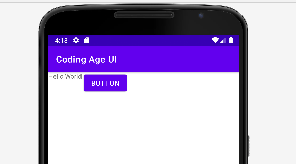
Relative Layout: A relative layout allows you to position UI elements relative to each other. For example, you can place a button to the right of a text field, or center an image within a layout. Here's an example:
<RelativeLayout
android:layout_width="match_parent"
android:layout_height="match_parent">
<TextView
android:id="@+id/text_view"
android:layout_width="wrap_content"
android:layout_height="wrap_content"
android:text="Hello World!"/>
<Button
android:layout_width="wrap_content"
android:layout_height="wrap_content"
android:text="Button"
android:layout_toRightOf="@id/text_view"/>
</RelativeLayout>
Relative Layout will look like this -
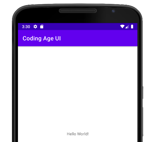
Constraint Layout: A constraint layout allows you to create complex layouts with a flat view hierarchy. You can position UI elements relative to each other using constraints, which specify the distance between elements and their alignment. Constraint Layout uses a set of constraints to position and size UI elements relative to each other and the parent container. You can learn more about Constraint Layout in the Android documentation. Here's an example:
<androidx.constraintlayout.widget.ConstraintLayout
android:layout_width="match_parent"
android:layout_height="match_parent">
<TextView
android:id="@+id/text_view"
android:layout_width="wrap_content"
android:layout_height="wrap_content"
android:text="HelloWorld!"
app:layout_constraintLeft_toLeftOf="parent"
app:layout_constraintTop_toTopOf="parent"/>
<Button
android:layout_width="wrap_content"
android:layout_height="wrap_content"
android:text="Button"
app:layout_constraintLeft_toRightOf="@id/text_view"
app:layout_constraintTop_toTopOf="@id/text_view"/></androidx.constraintlayout.widget.ConstraintLayout>
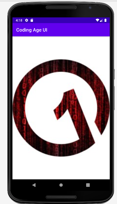
By Default first app in java is built in constraint layout -
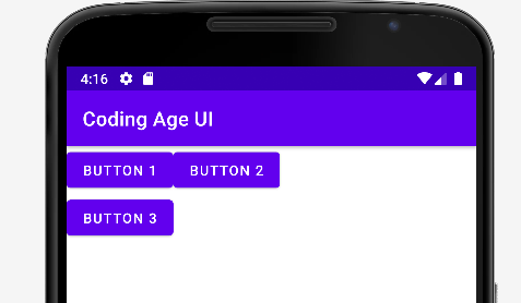
Grid Layout: A grid layout arranges UI elements in a grid, with rows and columns. This is useful for displaying data in a table-like format, or for creating a visually pleasing layout with multiple widgets. Here's an example:
<GridLayout
android:layout_width="match_parent"
android:layout_height="wrap_content"
android:rowCount="2"
android:columnCount="2">
<Button
android:layout_width="wrap_content"
android:layout_height="wrap_content"
android:text="Button 1"/>
<Button
android:layout_width="wrap_content"
android:layout_height="wrap_content"
android:text="Button 2"/>
<Button
android:layout_width="wrap_content"
android:layout_height="wrap_content"
android:text="Button 3"/>
</GridLayout>
Grid layout will look like this -
Frame Layout: A frame layout is a simple layout that places a single widget at the top-left corner of the screen. This is useful for displaying a single UI element, such as an image or a text box. Here's an example:
<FrameLayout
android:layout_width="match_parent"
android:layout_height="match_parent">
<ImageView
android:layout_width="match_parent"
android:layout_height="match_parent"
android:src="@drawable/image"/>
</FrameLayout>
Frame Layout will look like this -
These are just a few examples of the many types of UI layouts available in Android. Choosing the right layout for your app depends on your specific needs and the design of your app. By understanding the strengths and weaknesses of each type of layout, you can create a UI that's both functional and visually appealing.
RecyclerView: RecyclerView is a more advanced layout manager that's designed for displaying large sets of data, such as lists or grids. It allows you to efficiently display and manipulate data by recycling views that are no longer visible. RecyclerView is highly customizable and can be used to create a wide range of UI layouts. You can learn more about RecyclerView in the Android documentation.
Material Design: Material Design is a design system created by Google that's used to create visually appealing and consistent user interfaces. It includes a set of guidelines and components that can be used to create modern and intuitive user interfaces. Material Design encourages the use of animations, bold colors, and shadows to create a sense of depth and hierarchy in the UI. You can learn more about Material Design in the Android documentation.
Data Binding: Data Binding is a feature that allows you to bind UI elements to data sources, such as objects or variables. This can simplify your code and make it easier to manage UI updates. Data Binding can also improve performance by reducing the amount of code needed to update UI elements. You can learn more about Data Binding in the Android documentation.
These are just a few advanced topics related to UI layout in Android. By mastering these concepts, you can create beautiful and responsive user interfaces that provide a great user experience.
UI Controls
UI controls, also known as widgets, are the building blocks of any Android app. They're used to create user interfaces that allow users to interact with the app. There are many different types of UI controls in Android, each with its own set of properties and methods.
Types of UI Controls in Android:
TextView: TextView is used to display text on the screen. It can be used to display static text, as well as text that's dynamically generated at runtime.
EditText: EditText is used to allow the user to input text. It can be used to accept user input for various purposes such as username, password, search query, etc.
Button: Button is used to create clickable buttons that trigger an action when clicked.
ImageButton: ImageButton is similar to a button, but it displays an image instead of text.
CheckBox: CheckBox is used to create a toggle button that can be turned on or off.
RadioButton: RadioButton is used to create a set of mutually exclusive options. Only one option can be selected at a time.
Switch: Switch is used to create a toggle button that can be turned on or off.
ProgressBar: ProgressBar is used to display the progress of an ongoing task, such as a file download or a data upload.
SeekBar: SeekBar is used to create a slider that allows the user to select a value within a range.
Spinner: Spinner is used to create a dropdown list of options.
DatePicker: DatePicker is used to allow the user to select a date.
TimePicker: TimePicker is used to allow the user to select a time.
These are just a few examples of the many UI controls available in Android. Each control has its own set of properties and methods that can be used to customize its behavior and appearance.
Creating UI Controls in Android:
To create a UI control in Android, you'll need to add it to your app's layout file. The layout file is an XML file that defines the structure and appearance of the user interface. Here's an example of how to create a TextView:
<TextView
    android:id="@+id/my_text_view"
    android:layout_width="wrap_content"
    android:layout_height="wrap_content"
    android:text="Hello, World!"
    android:textSize="24sp" />
In this example, we're creating a TextView with an id of "my_text_view". The layout_width and layout_height attributes are set to "wrap_content", which means that the TextView will be sized based on its content. The text attribute is set to "Hello, World!", which is the text that will be displayed. The textSize attribute is set to 24sp, which is the font size of the text.
To create other UI controls, you'll need to use the appropriate XML tag and set the appropriate attributes.
Customizing UI Controls in Android:
UI controls in Android can be customized in a variety of ways. Here are some common ways to customize UI controls:
Setting properties: Most UI controls have a set of properties that can be used to customize their appearance and behavior. For example, you can set the textColor property of a TextView to change the color of the text.
Applying styles: Styles are a set of properties that can be applied to one or more UI controls to customize their appearance. You can create your own styles or use pre-defined styles provided by Android.
Using themes: Themes are a set of styles that can be applied to the entire app or individual activities. Themes can be used to customize the appearance of the app, such as the color scheme, font and other visual elements.
Using drawables: Drawables are images and other visual elements that can be used to customize the appearance of UI controls. For example, you can set the background of a button to a drawable to give it a custom appearance.
Using animations: Animations can be used to add visual effects to UI controls, such as fading in or out, sliding in from the side, or bouncing up and down.
Implementing custom UI controls: If the built-in UI controls don't meet your needs, you can create your own custom UI controls. This involves creating a new class that extends an existing UI control or creating a completely new UI control from scratch.
Here's an example code snippet that demonstrates how to use some of the UI controls mentioned earlier in one screen:
<RelativeLayout xmlns:android="http://schemas.android.com/apk/res/android"
    xmlns:tools="http://schemas.android.com/tools"
    android:layout_width="match_parent"
    android:layout_height="match_parent">

    <!-- TextView for Title -->
    <TextView
        android:id="@+id/titleTextView"
        android:layout_width="wrap_content"
        android:layout_height="wrap_content"
        android:text="Login"
        android:textColor="#000"
        android:textSize="24sp"
        android:textStyle="bold"
        android:layout_centerHorizontal="true"
        android:layout_marginTop="48dp"/>

    <!-- EditText for Email Address -->
    <EditText
        android:id="@+id/emailEditText"
        android:layout_width="match_parent"
        android:layout_height="wrap_content"
        android:layout_below="@+id/titleTextView"
        android:layout_marginStart="24dp"
        android:layout_marginTop="48dp"
        android:layout_marginEnd="24dp"
        android:hint="Email Address"/>

    <!-- EditText for Password -->
    <EditText
        android:id="@+id/passwordEditText"
        android:layout_width="match_parent"
        android:layout_height="wrap_content"
        android:layout_below="@+id/emailEditText"
        android:layout_marginStart="24dp"
        android:layout_marginTop="24dp"
        android:layout_marginEnd="24dp"
        android:inputType="textPassword"
        android:hint="Password"/>

    <!-- Button for Login -->
    <Button
        android:id="@+id/loginButton"
        android:layout_width="wrap_content"
        android:layout_height="wrap_content"
        android:layout_below="@+id/passwordEditText"
        android:layout_centerHorizontal="true"
        android:layout_marginTop="24dp"
        android:text="Login"/>

    <!-- CheckBox for Remember Me -->
    <CheckBox
        android:id="@+id/rememberMeCheckBox"
        android:layout_width="wrap_content"
        android:layout_height="wrap_content"
        android:layout_below="@+id/loginButton"
        android:layout_marginStart="24dp"
        android:layout_marginTop="24dp"
        android:text="Remember Me"/>

    <!-- RadioGroup for Login Type -->
    <RadioGroup
        android:id="@+id/loginTypeRadioGroup"
        android:layout_width="match_parent"
        android:layout_height="wrap_content"
        android:layout_below="@+id/rememberMeCheckBox"
        android:orientation="horizontal"
        android:layout_marginStart="24dp"
        android:layout_marginTop="24dp">

        <RadioButton
            android:id="@+id/emailRadioButton"
            android:layout_width="wrap_content"
            android:layout_height="wrap_content"
            android:text="Email"/>

        <RadioButton
            android:id="@+id/phoneRadioButton"
            android:layout_width="wrap_content"
            android:layout_height="wrap_content"
            android:text="Phone"/>

    </RadioGroup>

    <!-- Switch for Push Notifications -->
    <Switch
        android:id="@+id/pushNotificationSwitch"
        android:layout_width="wrap_content"
        android:layout_height="wrap_content"
        android:layout_below="@+id/loginTypeRadioGroup"
        android:layout_marginStart="24dp"
        android:layout_marginTop="24dp"
        android:text="Push Notifications"
        tools:ignore="UseSwitchCompatOrMaterialXml" />

</RelativeLayout>
User Interface of above code will look like this -
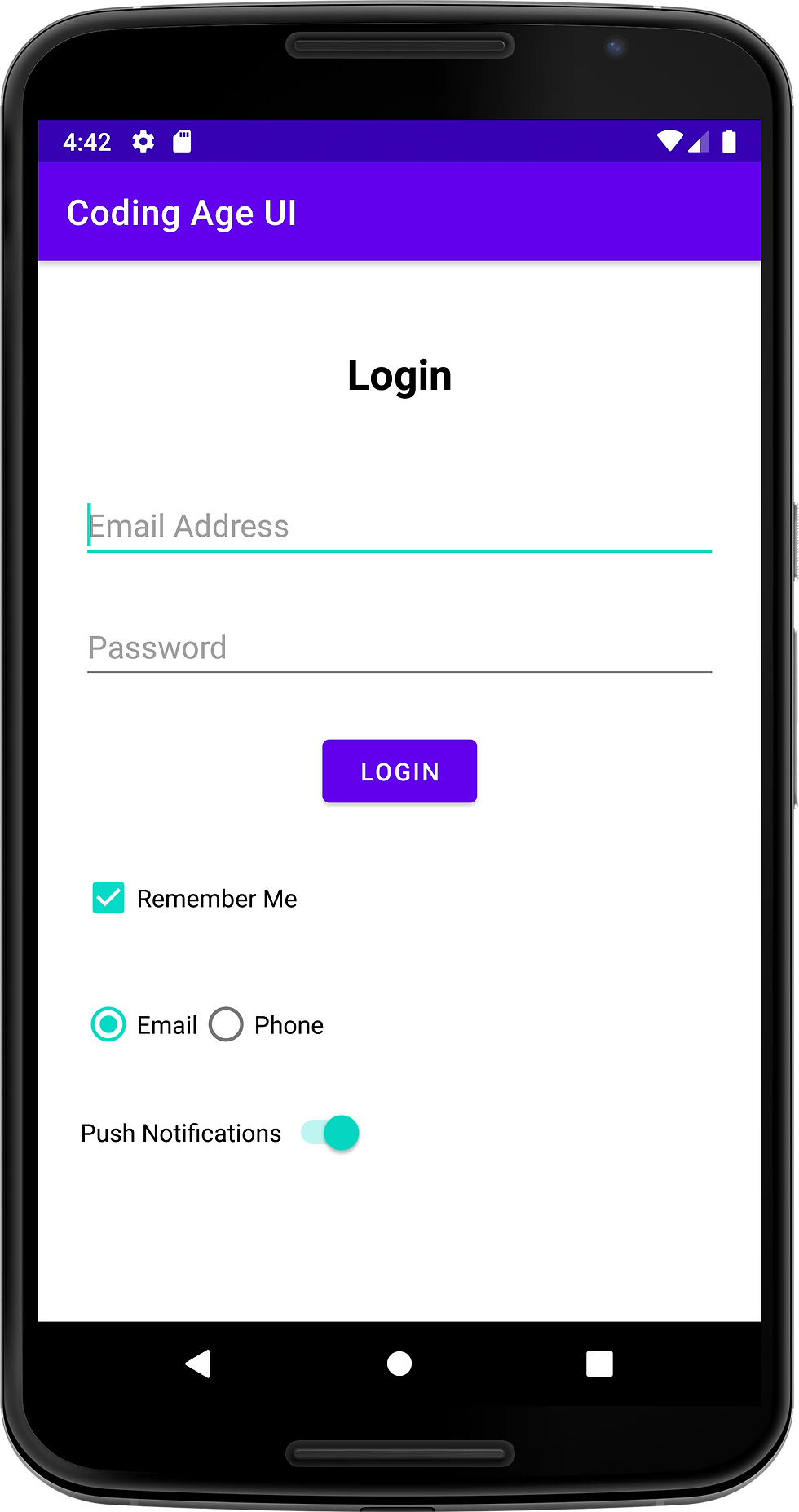
This code creates a login screen with a title, email and password fields, a login button, a remember me checkbox, login type radio buttons, and a push notification switch.
Overall, UI controls are an essential part of Android app development. By understanding how to create and customize UI controls, you can create apps that are not only functional but also visually appealing and easy to use.
Thanks for reading, and happy coding!
Master Android Development in Java Series part-9 -> Mastering Event Handling, Styles, and Themes in Android App Development